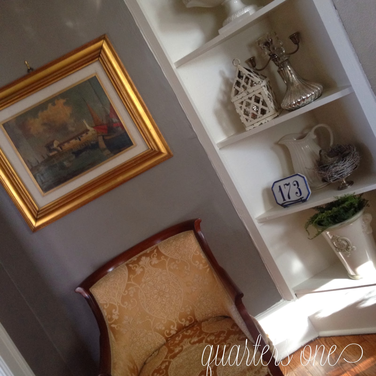
You know the old saying…military quarters are like a box of chocolates, you never know what you're going to get…or something like that! Oh boy, that has certainly been the case with us. If you followed Q1 at Ft. Riley, you may know that our quarters were so large it had a dining room with a table that sat 24! It was very unusual and we were blessed.
 |
| See more photos here! Our current space was built in 1899 and comes with all the quirks that are so endearing about "updated" historic quarters, hmmm... let's just say I'm warming up to these cozy accommodations. Here are a few before shots of our town house style dining room. |
This odd configuration was a fireplace once. I'm not wild about the built-in shelving.
I don't even know what to say about the world's most unattractive heating and air boxes that are positioned in the worst possible places in this house.
The chandelier is beautiful but it's too small for the room and hung too high. I am planning to rehang it in the guest bedroom.
These two windows are the only source of natural light.
I might have made a mistake in painting the walls Backdrop by Sherwin Williams. I adore the color with all of my gold and red, but, it's very dark on a dreary day…which we seem to have a lot of here, lately.
So, here's what we've done so far..
I might have made a mistake in painting the walls Backdrop by Sherwin Williams. I adore the color with all of my gold and red, but, it's very dark on a dreary day…which we seem to have a lot of here, lately.
So, here's what we've done so far..
I'm not sure how many more moves this old china cabinet can take, we purchased it when we were stationed in Italy, and it has held up pretty well considering its travels! Love my Italian gold fabric, it has hung in many different spaces.
Our own dining room table that sits 8-10 on a good day.
A painting of Delft and my new sconces I picked up at La Bella Luce. I added the crystals for some bling, what else would anyone who knows me expect?!
I love Rembrandt's last self portrait, 1669. This reproduction is quite a bit larger and several years younger!
Because the room is generally dark, I kept everything silver and white on the shelves.
Backdrop is a warm neutral grey brown that goes beautifully with rich colors like gold and red.
Our own dining room table that sits 8-10 on a good day.
A painting of Delft and my new sconces I picked up at La Bella Luce. I added the crystals for some bling, what else would anyone who knows me expect?!
I love Rembrandt's last self portrait, 1669. This reproduction is quite a bit larger and several years younger!
Because the room is generally dark, I kept everything silver and white on the shelves.
When I use something here I just rearrange to fill the empty space!
This is a dark Instagram photo but I wanted to show the curtains, I chose to hang them this way to open the small room. Four panels would have just made the room too closed in.Backdrop is a warm neutral grey brown that goes beautifully with rich colors like gold and red.
When I unpacked my dining room chandelier I discovered it was in need of some repair so I'm waiting to get that done and then have all of my chandeliers hung at once.
Thankful for Trader Joes, the best place for well priced flowers!
I am not a professional designer but I do love to pretend to be one! I am happy to share ideas and give a glimpse of the inside of quarters not everyone gets to see.
And lest I sound ungrateful…far from it! We're in a beautiful spot and I actually am happy to have downsized.
'Til next time!
www.facebook.com/quartersone
And lest I sound ungrateful…far from it! We're in a beautiful spot and I actually am happy to have downsized.
'Til next time!
www.facebook.com/quartersone


Even in 'quirky' updated historic housing, everything looks fantastic! You may not be a professional designer but you fake it quite well and I am blown away.
ReplyDeleteThank you!!
ReplyDeleteHmmm, I've actually told people you were a professional designer! Looks fantastic, Shand!
ReplyDeleteNo one would ever know that you're not a professional designer. You have a special gift! Your new home is beautiful!
ReplyDeleteLOVE!! you always have a way of presenting your perfect "Shand touch of style" to everything! :0) I enjoyed these pictures!! Thank you for sharing your talent with us!! :0)
ReplyDelete